
Restructuring the cuisine menu navigation and tagging system

The cuisine navigation menu before any content design juxtaposed with our V1 tiered menu.
The problems
Over a decade of inconsistent cuisine tagging across all markets
Poor SEO due to thin subsections and duplicate tags (e.g. steak, steaks, steakhouse)
Bloated, hard-to-navigate menus
Inconsistent user experience when searching across cities
Unusable backend data for personalization and AI tools
Background
Since 2010, writers at The Infatuation have added cuisine tags manually into our Contentful CMS as they published stories. The CMS was not designed to give a drop down menu of tag options, so writers were having to remember off the top of their heads what tags we already had and type them in. The opening for human error and overlap with other writers’ tag assumptions was huge.
In the navigation UI, cuisines, dishes (pizza, burger), venues (bar, cafe), and sometimes even just food groups (cheese) were lumped together and listed alphabetically under a general “Cuisines” header.
This led to incredibly long navigation menus, thin subsection pages that killed our SEO metrics, and a duplicate tags issue as writers would add new tags with slight variations (e.g. steak, steaks, steakhouse).
Our tags varied so much from city to city that a person wouldn’t be able to find the same info on another city’s page for a trip to another market. Being the travel use case was a big reason people came to us, it limited our ability to be the best platform for helping people plan where to eat on vacation.
This affected not just navigation menus or a reader’s travel experience, but also our ability to power personalization and AI tools, which are only as good as their data inputs.
Because no one had previously had the bandwidth to do a tag audit, no one realized how tangled and more unreliable the backend data was becoming every day.
This affected our product further as we had two personalization products that couldn’t go live after beta testing because the tags were unreliable and confusing.
Being my manager was on paternity leave, I took the initiative to lead a full content audit part of which was to clean, restructure, and clarify our tags across cuisines, “perfect for” situations, and neighborhoods.
Here we’ll focus on cuisines.

The first stage of my audit compared the NYC cuisine page to the LA cuisine page, to demonstrate the problem to our product and editorial leads and begin to understand our tagging process, weaknesses, and improvements. I then scrubbed all 12 of our major markets.
My approach
For cuisine tags specifically, my challenge was to scrub the data to better power personalization tools and re-organize the taxonomy of our tags without hurting our SEO. Being navigation menus factor heavily into Google’s specific algorithm, I needed to be precise and careful as most of our traffic came from there.
The goal was to create a menu structure that could be replicated across all markets for a more consistent experience, while allowing cities to have unique menus reflective of their diverse dining scenes, and allow users from search engines or on our site to find what they wanted quickly.

An early idea that didn’t work: seeing if we could categorize cuisines by part of the world.
However, some cuisines are named after ethnic groups that have been forced from their homes and relocated. Other cuisines span larger regions — for example, “Mediterranean” could technically apply to the 22 countries that border the Mediterranean Sea, which span Europe, the Middle East, and North Africa.
“How nuanced do we actually need to be?”
I love data dives and spreadsheets (I know, I know, I’m a weirdo), so I dug into our Google Analytics data to find out what users were searching for both in our navigation menu and article tags for the past year.
Normally I would look for longer term data, but because this was 2023 and we were just coming out the pandemic when many restaurants closed, changed their menus to offer takeout friendly packages, and people were disrupted from their normal dining habits, I chose to only look at the last year’s data when the dining scene behavior was more normalized.
The data showed that users consistently searched for and clicked on a handful of popular dishes and cuisines in each market, with a sharp drop-off in the numbers from there. Each major market had its own specific mix of top-searched tags and popular cuisines that drove the vast majority of traffic.

I pulled click data from our navigation menu and in story tags to see what users were searching for. I found that our top trafficked tags included specific dishes and general cuisines. This meant I needed a way to reveal both in the navigation.
*Note* I blacked out the numbers in columns B, E, L, N, P, and S for company data privacy purposes.
I needed to figure out the balance between user behavior, SEO rankings, and cuisine variety.
Our DEI lead was also consulted as due to geopolitical conflicts, the representation of cuisines in a tiered menu could be misinterpreted as supporting one side or another, so we needed to find a way be neutral yet still be inclusive.
The best way to bridge this was to reveal our top searched cuisines, dishes, and venue types together as they had equal SEO and user interest value over time. I could then tier the menu to hide the rest of the tags as to not overwhelm users.
Our much smaller group of users who wanted greater variety could still reveal all the other cuisine tags in a better organized manner. This allowed us to show a diverse range of options while keeping the menu lightweight.
Because venue type was a complicated mini project within the tagging system, we launched with a V1 version that shows trending guides in the right rail.
Our V2 has venue types included with icons that will also appear on our maps for easier searching.

V1 of our updated, tiered navigation menu for cuisines. I customized each city’s Popular Cuisines and Top Searched Dishes to be representative of that city’s data for localization purposes.
Using user behavior data, SEO insights, and DEI guidance, I developed a tiered, scalable tagging system that balanced clarity, variety, and local nuance as each city’s data was slightly different for top cuisines and dishes.
We could now support our growth initiatives, power personalization and AI products, and present a clean UI for users.
The results:
🌍 Each major market received its own unique, localized mix of top cuisines and dishes in the nav.
🚀 Boosted our SEO by leading with expertise, leaning into our local authority, and building user trust.
🧠 Reduced cognitive load by tiering the data for faster navigation.
👯♀️ Eliminated duplicate cuisine tags to ensure data fidelity which improved our AI and personalization products.

By choosing a tiered cuisine menu, we could show users what was popular and trending in a city, and allow them the option to view the full spectrum of nuanced cuisines that their city has to offer.
This V2 version includes venue types.
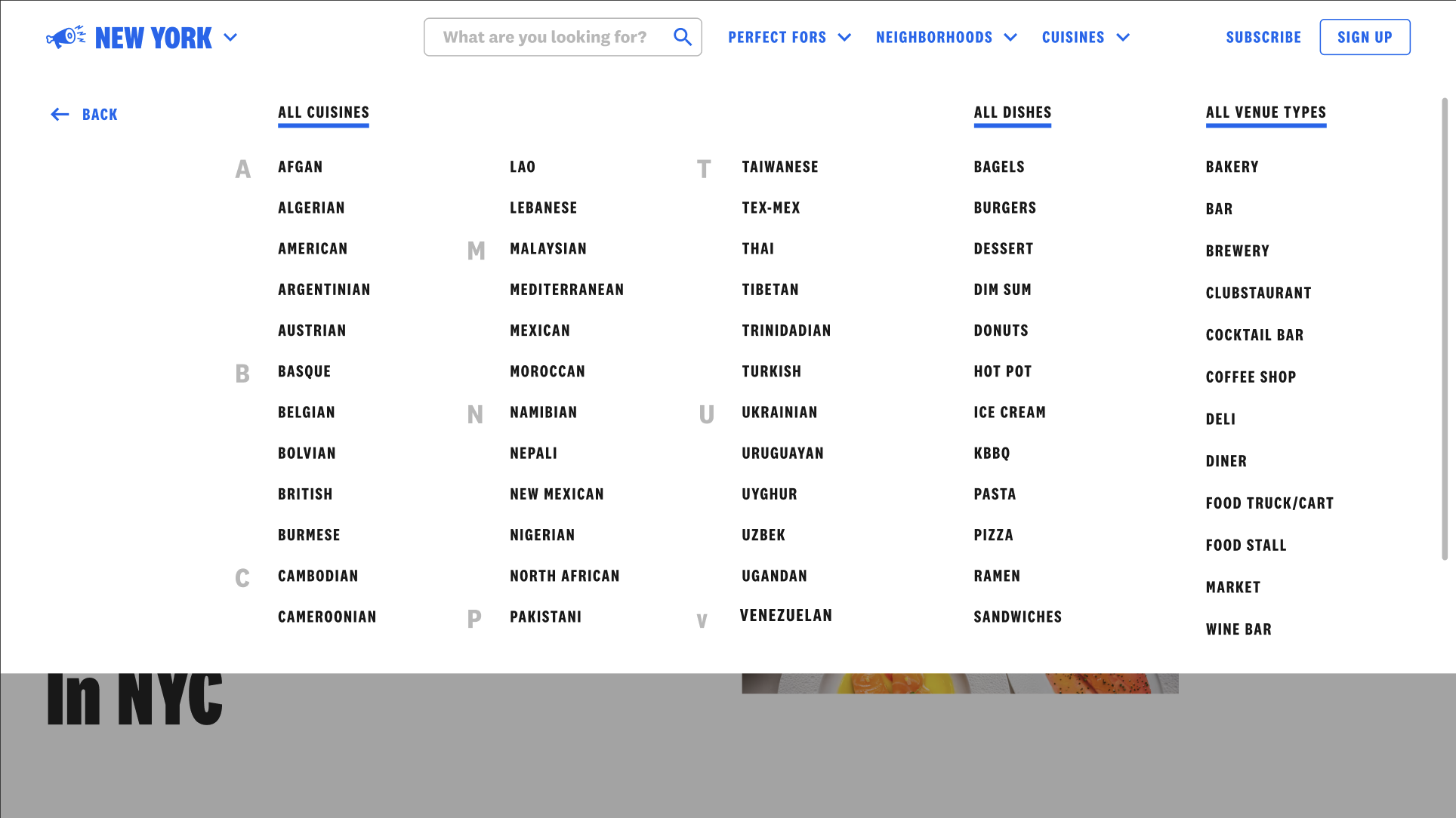
After a user clicks “View All” on the first tier, they are taken to this alphabetical menu where they can see every type of cuisine, dish, and venue type. The menu scrolls down so we can fit them all without taking readers off the page.